One of the difficult things about designing for the web is that we don't get to really control the way our content is viewed: the user's web browser is responsible for processing our HTML, CSS, and JavaScript.
When designing web pages, you should try to create responsive designs. That is, make sure your pages are nicely readable on a wide variety of devices.
Device Sizes
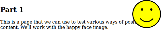
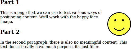
Recall the page from Positioning in CSS that used position: absolute. We showed this screenshot of the page (scaled for comparison with the later screenshots):
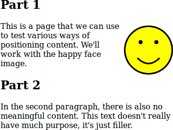
But if you were working with the same stylesheet, that's probably not exactly what the page would look like: your screen is probably larger than that. (The screenshots here are taken in quite small browser windows, so they are readable.) Your view of the same page would have been more like this, a screenshot from a (not particularly large) desktop display:
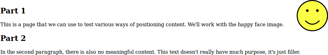
This page looks perfectly fine with that window size. When working on the page, it would be very easy to look at it and conclude that everything fits together with no overlap. Unfortunately, that would only be true with that window size (or in this case, anything larger).
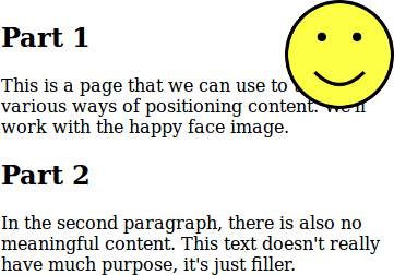
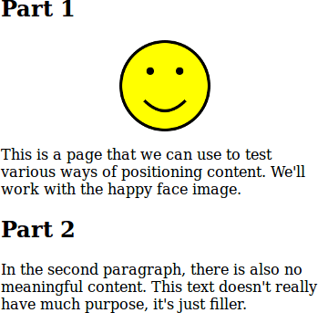
On a phone, the same page would look something like this, again depending on the exact screen size. The overlap is even worse.
Many beginners to web design make the mistake of only looking at their pages on their own screen, and never test on larger or smaller screens. Be careful not to fall into his trap.
Since most people create web pages on desktop computer or laptops, larger screens aren't usually the problem: they are working on a large screen already. Here are some ways that every web developer should test their pages:
- Resize your browser window: not everybody has the same screen, or keeps their browser maximized.
- Shrink your browser window to a phone-like size to see how the elements of your page fit with smaller space. Even better: actually try the page on a smartphone.
- Try the largest browser window you can (and scale the page with ctrl-minus/⌘-minus and ctrl-plus/⌘-plus to get an even wider range), to make sure things are still readable.
One common problem on larger screens is long lines: lines of text that extend all the way across a large display are very difficult to read. It may be wise to start with CSS like this, to help keep things readable: *
body {
  max-width: 40em;
  line-height: 1.4;
  margin: 1em auto;
  color: #333;
}
This makes sure lines aren't too long (up to 40em, depending on device width) and that lines have a reasonable spacing (line-height) to keep even that width easily readable. The third line sets a 1em margin on the top and bottom, and an automatically-maximum margin on the left and right: that centres the text. Finally, the dark-grey text colour is common advice to slightly reduce the contrast to make text more readable.
The style for this Guide includes most of the above, except with maximum line length 50em to create enough width for code examples.
Being Mobile-Friendly
Making your pages look good on small-screen mobile browsers isn't always easy. In part, this is because mobile browsers are trying to outsmart you: they might get a beautiful mobile-friendly design, or they might have to display a desktop-only site as best they can, and have to detect which situation they're in.
Often, phone browsers will decide that your page isn't mobile-friendly and display it with a desktop-like width like this:

You have to take one small step to tell mobile browsers you know what you're doing. Add this to the <head> of your pages:
<meta name="viewport" content="width=device-width,initial-scale=1" />
The details aren't important, only that this line tells mobile browsers that your page can be displayed nicely on small screens, and that you'll take responsibility for having a responsive design. The result is that pages are displayed on phones with a reasonable page with. This is the same page (on the same phone) with the <meta> above added:
That <meta> tag, combined with the the basic CSS above, will make a page that is readable on any device. Design decisions you make after that might break on different browser sizes, but at least things have started well.
Media Queries
It's often possible to adapt your design to different screen sizes by just testing on different windows sizes and tweaking your HTML. If you can do this, it's probably easiest.
Situations can arise where you need a page to look very different on smaller screens: the way things were arranged make sense on larger screens, but not on smaller ones. This is especially true if you have elements arranged beside one another with float or position.
For example, consider our first example with the float property. It looked okay in the screenshot (if we ignore the float-beside-heading problem for now):
But if we look at the same page on a phone-sized window, the paragraph beside the floating figure is a little too narrow (or certainly would be if the figure was much larger):
In this case, we might want to completely change the way the figure is positioned on small screens. We can use CSS media queries to do this. They give us a way to express “on a smaller screen, do this…” in our style.
For example, we can say that if the screen is smaller than 480 pixels (a common dividing line for phone-like screens: tablets and computer displays are typically larger than that), we don't want to float the figure, but want to style it differently:
#happy {
  float: right;
}
@media (max-width: 480px) {
  #happy {
    float: none;
    text-align: center;
  }
}
In larger browser windows, the page will look as above. On a phone-sized screen, it will now look like this:
You can try this example: the size selector on the page won't trigger the media query if the window size is still large. You'll have to resize your browser window to see the change.
It's also possible to modify your style for other situations. For example, you might decide that if pages are being printed, you don't want the figures to display at all. This expresses that:
@media print {
  figure {
    display: none;
  }
}
If you do a “Print Preview” on that same example, you shouldn't see the image (but should see it in all cases for on-screen browsing).
Another example: the text of this Guide is usually full justified. That doesn't look great on a small screens since the spaces between words become very large. The CSS for the Guide includes this:
body {
  text-align: justify;
}
@media (max-width: 480px) {
  body {
    text-align: left;
  }
}
The media queries in CSS give you a lot of power to adapt your design to different situations, both screen sizes and other considerations. They require you to actually think about those situations, which is often the hard part.