The more page layout you do with CSS, the more you're likely to run into things that are either difficult to do with CSS, or just tricky. We saw some basic techinques in Positioning in CSS: these techniques are fairly straightforward, but it can be difficult to get them just right, or to predict how different parts of your style will interact with each other.
This is particularly a problem if the content of the pages changes (or if your style gets applied to newly created content that you didn't get to look at when creating the CSS). It can also be challenging to get a layout right on a wide variety of devices, as we saw in Responsive Design.
The jQuery and Raphaël libraries helped us do things with JavaScript that would have been difficult to do on our own. In some sense, we're having the same problem with CSS and will look for the same solution: some pre-made code that solves common problems and can help us get things working more easily.
The CSS resets introduced in Browser Compatibilty and font loaders from CSS Fonts do some of this: they are pre-packaged CSS code that help deal with common problems. Those are both fairly limited in scope however: they do one thing only but do it well.
CSS frameworks are are pre-prepared stylesheet code (often including JavaScript code as well) that can be used to help with a wide variety of common styling problems. If you are creating a new site, you may find them very useful to get started creating a modern responsive site.
Bootstrap
The most popular CSS framework is Bootstrap, which was originally created at Twitter for their site. It provides many useful CSS utilities. It starts with a nicer default CSS, and then gives you classes that you can apply to elements to use other features as you need them. You can load it and add your own stylesheet to customize parts as you like:
<link rel="stylesheet" href="https://maxcdn.bootstrapcdn.com/bootstrap/4.0.0-alpha.4/css/bootstrap.min.css" />
<link rel="stylesheet" href="bootstrap-changes.css" />
Columns and the Grid
One of the most powerful features is “columns”. Your page is automatically divided up into 12 columns. In you page, you can create content that takes up any number of these columns. For example, to create a menu that takes up the left quarter of the page (3 out of 12 columns), and main content that uses the rest, simply add appropriate classes (and <div>s if necessary):
<section class="container">
  <div class="row">
    <nav class="col-xs-3"> [the menu] </nav>
    <main class="col-xs-9"> [main content] </main>
  </div>
</section>
You can also have the column contents take up different amounts of space, depending on the window size. This makes it easy to do both positioning and responsive layout.
In order to make this easy, Bootstrap gives five window sizes: extra-small (xs, roughly phone-sized), small (sm, small tablet-sized), medium (md, large tablet or small desktop), large (lg, desktop screen), extra-large (xl, huge desktop screen). Each of these is part of several classes that are modified in the Bootstrap stylesheet.
For example, we might have some content that we want arranged in three columns on desktop screens, two columns on smaller tablet screens, and in one column (simply stacked vertically) on phone screens. That translates to each piece of content being 4 of 12 columns on medium (and larger) screens; 6 of 12 on small screens, and 12 of 12 on extra-small screens.
<div class="row">
  <div class="col-xs-12 col-sm-6 col-md-4"> … </div>
  <div class="col-xs-12 col-sm-6 col-md-4"> … </div>
  <div class="col-xs-12 col-sm-6 col-md-4"> …
    <figure class="hidden-xs-down">…</figure></div>
</div>
You can try this demo page for yourself: resize the browser window to see how it will behave on differently sized devices. On “medium” or larger screens, which should include all desktops and larger tablets, it will look like this:
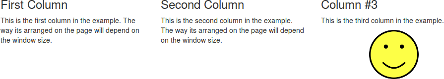
Since the blocks are set to take up four columns (class col-md-4) on those sizes, three of them can fit horizontally.
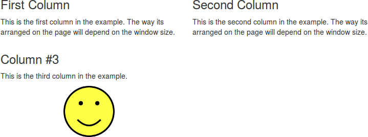
On “small” screens, the class col-sm-6 indicates that they shold take up six of the twelve columns, so two of them fit and the third wraps:
On “extra-small” screens, each block takes up all 12 columns (class col-xs-12), so they stack vertically:
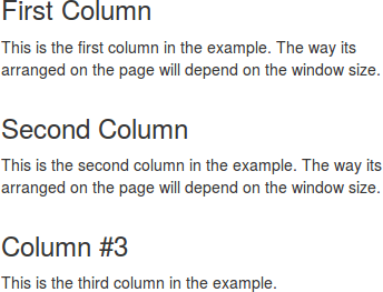
You can see in that screenshot that the <figure class="hidden-xs-down"> has disappeared. That class indicates that the content should be hidden on extra-small devices (and smaller, but visible on other sizes).
Other Styling
Bootstrap contains many other style options: it restyles several HTML elements by default so they look a little nicer. It also provides a collection of other classes that can be used to control your pages' appearance without having to write the CSS yourself.
There are a few more examples on the Bootstrap demo page, but we won't go into details here.
Drawbacks
CSS frameworks are generally very useful: they make positioning much easier than fighting with float and position yourself. They are used on many modern web sites for exactly this reason.
The biggest drawback is that many web sites use them. Have another look at the Bootstrap demo page: does it look familiar? Because so many sites use Bootstrap, its default styles start to look very generic.
When working with a CSS framework like Bootstrap, don't forget that you can still override some of its styles with your own. For example, the “Jumbotron” that's at the top of the example page has this CSS (in part) in the Bootstrap CSS:
.jumbotron {
  padding: 2rem 1rem;
  margin-bottom: 2rem;
  background-color: #eceeef;
  border-radius: .3rem;
}
In your own stylesheet, you can override some of that to customize the look to your own tastes, and make it look different that every other Bootstrap site:
.jumbotron {
  background-color: #dfd;
  border-radius: 1rem;
}
The lesson here is really: remember that the CSS framework is just a stylesheet like any other. You don't have to forget everything you know about CSS when you start using it.