Most of the work we have done with CSS is fairly simple: changing fonts, colours, spacing, and borders. All of those changes are useful and necessary, but not the hard part of CSS.
Things become more interesting when you start moving stuff around the page.
The float Property
The easiest way to move content is the float property. It will take content and move it to the left or right sides of the page.
When floated content moves, whatever content follows it will move up, and flow around it. That means that the floated content will move to the side of the page, and other text will avoid overlapping with it.
As an example of float (and later CSS properties in this topic), we will use an HTML page structured like this:
<section id="p1">
<h2>Part 1</h2>
<figure id="happy">…</figure>
<p>…</p>
</section>
<section id="p2">
<h2>Part 2</h2>
<p>…</p>
</section>
To illustrate how float works, we will apply this CSS:
#happy {
  float: right;
}
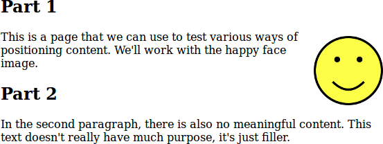
The resulting page will look like this:
You can see this example in your browser if you like. You can select the different stylesheets described here, and experiment with the width of the content to see how that affects the layout.
As you can see, the <figure> is moved to the right of the page, and text that comes after it avoids overlapping it, but below the figure, it extends back to the right side of the page.
Also note: the vertical position of the figure hasn't changed: it is immediately below the first <h2>, where you'd expect it. It only moved to the right. The following paragraph moved up and had its lines re-wrapped.
The clear Property
When floating some content like that, it's common to not necessarily know exactly what will follow. If you have a large floating block, it may be difficult to predict how it will interact with the content that follows.
In the above example, you can see that the second section starts while the floating content is still to its right. It would be unusual to start another section of the page while the content from the previous section is still there: it would be nice to move the following content down below the floating figure.
The clear property does just this: it tells the browser that you want to move a piece of content down until there is nothing floating beside it: either to the left, right, or both sides.
To solve the problem of starting a new section with content floating content still beside it, we can do something like this in CSS:
#happy {
  float: right;
}
section {
  clear: both;
}
It will look like this in the browser, with the following <section> moved down until there is nothing floating on either its left or right:
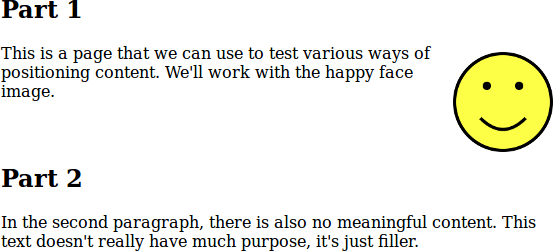
We could have also specified clear: right in this case, since there is nothing floating on the left. It's probably more complete to specify both: we wouldn't want to start a section with anything floating on the left if we did that later on some other page. You can experiment with this example as well.
The float and clear properties are good at what they do. There are, however, many visual design ideas that you could want to implement which are very difficult to map onto float operations. In those cases, we need to reach for a more powerful tool…
The position Property
The position property is both more powerful and more dangerous than float and clear.
Setting position: absolute on an element lets you use the CSS properties top, bottom, left, and right to move the element around the page to exactly where you want it. For example, setting top: 1em move the element so its top is 1em from the top of the page.
This sounds easy. For example, we can move the image to the top-right of the page like this:
#happy {
  position: absolute;
  top: 0;
  right: 0;
}
That will display like this. You can experiment with this example and the following ones as well.
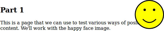
You can see the problem with position: as soon as you start positioning content, it is taken out of the normal flow of content on the page and will overlap other content. This is something you have to be very aware of when using position: you need to think of all of the possible ways your content can overlap on different devices and window sizes.
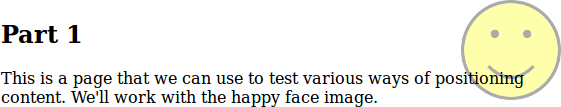
There are still some ways absolute positioning can be useful. For example, we could allow overlap, but make it look okay with opacity to make the content translucent.
#happy {
  position: absolute;
  top: 0;
  right: 0;
  opacity: 0.33;
  z-index: -1;
}
The negative z-index value moves the figure behind the other content. That seems reasonable: we can allow content to overlap, but it's okay because of the other styling done to it:
Another good use of absolute positioning: moving content around when you know exactly how much space you have to work with. For example, here we will move the figure up to the top of the page: this technique might be useful for a menu or page header (with page title, logo, and menu).
#happy {
  position: absolute;
  top: 0.5em;
  left: 0;
  width: 100%;
  margin: 0;
  text-align: center;
}
#happy img {
  width: 3em;
  height: 3em;
}
main>section:first-child {
  margin-top: 4em;
}
Here, the figure is at the top of the page, taking its entire width. The image (only content in it) is sized it's exactly 3em high.
There will be no overlap as long as we make sure the following content has a top margin 3em or larger. Selecting that first <section> was tricky because of the way the HTML was structured, but it does express the intention here.
There are other values that can be given to position. The default is static. Using position: relative works like static but you can adjust the position of the element relative to where it would have naturally been.
Setting position: fixed is like absolute, but relative to the window: fixed things won't move as the user scrolls. There is even more opportunity for unwanted content overlap that way.
The position you give (with top, left, etc) for an absolutely positioned element is usually relative to the entire page: the top of the entire page, left of the page, etc. This is not true if any element that contains the positioned one is itself positioned. This trick has been used on the the example page to get things floating/positioned within the example: the <main> has position: relative applied, not to move it but to make it contain floated/positioned thing within it.
Positioning Difficulties
As you may have noticed in this section (and while doing the assignments), positioning things the way you want in CSS can be difficult.
Using float is easy enough if you're doing what it was designed for: floating figures beside other content. If you are lucky enough to know exactly how big your content is, then position can be used without too much trouble.
There are many other ways you might want to arrange content though, where isn't not immediately obvious how to achieve them with float or position: a menu in a column to the left of other content; a photo gallery with three columns of images (but 2 on smaller screens); links styled like “tabs” above a section of content; and many more.
In CSS Frameworks, we will explore some tools that will make it easier to position and style content.