When creating web pages, you have to remember that the HTML and CSS (and later JavaScript) that you create is sent to the viewer as you create it.
That means that you don't have any real control over how the content is displayed: the user's web browser is responsible for turning your HTML and CSS into something that is displayed on screen. Whether or not it does so exactly the way you expect can be difficult to predict.
When you test a page in your web browser, all you have really proven is that it works with…
- your particular browser (Firefox, Chrome, etc);
- in the version of the browser you have;
- with your browser window size;
- with the fonts, plugins, etc. that you have installed.
That's not an acceptable assurance that your pages are actually going to work for anybody else. There are, however, a few things you can do to help make sure everything will go okay when your pages end up in different situations.
Produce Good Content
In the section Validating HTML, we talked about using a validator to make sure our HTML followed the rules of the language. That gave us some assurance that it would be understood the same way by any browser (or other tool like Google's indexer) that needs to work with it. Producing valid code definitely helps convince us that the page will work in any browser.
There is a similar CSS Validator that will make sure your CSS code follows the rules of that language. You should make sure the CSS you produce is also valid for the same reasons.
However, for CSS, the situation can be more complicated when it comes to actually working in different browsers…
Handle Browser CSS Defaults
Remember that when you add a stylesheet to your document, you are always adding to the browser's default CSS. These can vary in different browsers: some style certain elements by default while other don't; some style in visually similar ways by using different CSS properties. Working on top of these default stylesheets can be difficult, since it's hard to predict what a different browser will do.
You can use a reset stylesheet to help overcome this. These are pre-prepared stylesheets that remove all of the defaults set by browsers. The idea is that you will then have a consistent starting point that you can build from. You can apply both a reset stylesheet and your own customizations by including two <link> elements like this:
<link rel="stylesheet" href="reset.css" />
<link rel="stylesheet" href="my-style.css" />
For example, a reset CSS will remove font-style: italic from <em> elements. If you want <em> styled a particular way, you must add that style choice back in your own CSS. This can mean a little more work for you (since you have to replace default styles), but it gives some comfort that you know what style changes will be applied and forces you to think about the styling of these basic elements, which can be a good part of the design process.
Check Browser Compatibility
With CSS especially, there is a big question of whether or not a particular browser will even understand the features you are using. CSS has been under very active development in recent years, and even new web browsers won't be able to produce all of the effects implied by the CSS Reference.
This is less of an issue in HTML, which has been a little more stable recently. The only HTML compatibility issues will come from older versions of Internet Explorer. For this course, we will happily ignore old IE versions and move on.
For CSS, you need to be aware of what features you can safely use. Properties we have explicitly discussed in this Guide can be used universally, but that's a small fraction of what is available.
For other properties, you should check for information about their browser compatibility. The CSS Reference that we are using includes some: at the bottom of pages about CSS properties is a table of when support for various features appeared.
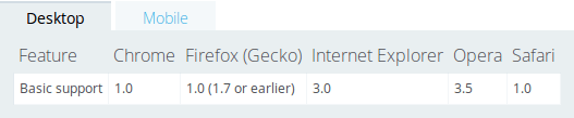
Here are screenshots of the availability of two CSS properties in various browsers. The first is a very old and well-established feature. The second is currently quite experimental.
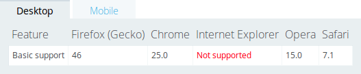
In the second table of compatibility information indicates Firefox 46 (released in April 2016), Chrome 23 (released November 2012), and no support in any Internet Explorer version (as of this screenshot).
The result here is that the first property (which was color) can be used freely, and you have a good idea that it will work. The second probably can only be used in a very experimental way (or in a situation where you don't really care if the effect appears).
Also notice in the compatibility table the second tab for mobile browser compatibility. These are usually similar: different browsers add new features at different times. In both cases, exactly which browser version you “must” support is unclear and generally depends on your audience.
This can be a very frustrating aspect of working with CSS, but it's unavoidable. As you're learning new CSS features, you have no choice but to also learn if they're actually usable in current browsers.
Test Pages Well
The compatibility information in the references will give you information that you couldn't have uncovered on your own. They are still no substitute for actually seeing your page work in various situations.
You should be sure to test your pages with different browsers and make sure they work the way you expect.
Resize your browser window: not everybody has the same size screen, and not everybody keeps their browser at the full screen size. Resize your browser to a few different sizes and make sure your page still fits together and looks okay.
Try a different browser: if you usually use Chrome, try your pages in Firefox and Internet Explorer. They will usually be the same, but you may find compatibility and default CSS differences you need to work around.
Try a mobile device: Will your pages work on a phone? You can't test every possible mobile browser, but you can at least try one and make sure your page looks reasonable on a small screen. Trying your page in a very small browser window on your computer will generally give you a good idea how it will look on a phone, but quick look on a different device is probably a good idea.
Again, having to do these checks can be frustrating, but the flexibility of the web make it necessary to produce pages that work in different situations.