Figures and Diagrams
Figures and Diagrams
Prelude videos from Lynda.com:
- Charts and diagrams (in the course Design 101: Presentations)
- Visualization for presentation (in the course Introduction to Data Science)
Students can enter through the library's Lynda.com portal for free access.
Figures and Diagrams
This topic is about the not-words aspects of technical writing.
Honesty time: I almost never think to visualize concepts, but always choose words.
Data & Information
We often start with info and need to present it in an understandable way. Some examples:
- Relational data:
(1, 'Audi', 50000, 5),(2, 'Toyota', 24000, 5) - Analysis results: μ = 47.2, σ = 8.32
- Sensor data: (10:13:45, 18.349216), (10:13:46, 17.932129)
- Other tabular data
- Information flow in an algorithm
Data & Information
Sometimes a visual representation is the best way convey this information. There are a lot of choices that can be made when designing a visualization.
How can we make them reasonably?
Data & Information
There are also a lot of choices when writing a sentence or paragraph.
Let's approach them the same way: look at some of the choices available, and when you might make them.
Visualization Choices
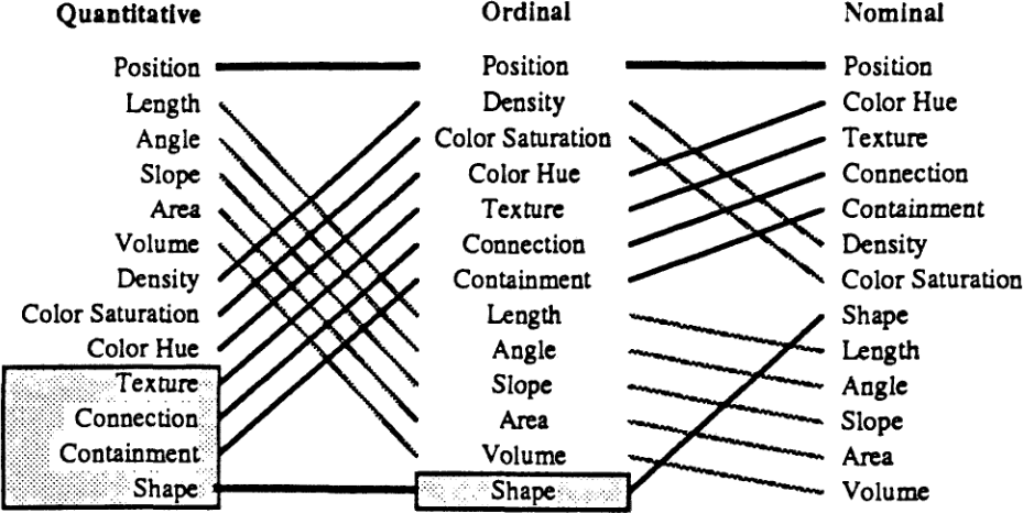
Mackinlay presents this ranking of “graphical languages”:
Visualization Choices
Visualization Choices
The categories of task presented there:
- Quantitative
- Numeric values that have magnitude: -4.2 vs 18.9.
- Ordinal
- Ordered values or categories with no magnitude: unsatisfied/neutral/satisfied, 0–9/10–19/20–29/30–39.
- Nominal
- Unordered properties or categories: male/female, SFU/UBC/UVic.
Visualization Choices
Each of these kinds of data has different “graphical languages” that will be better or worse at bringing it across to the reader.
Position
The position of elements is the one thing you have to vary: content can't all be in the same position.

Position
For quantitative values, the position can represent the magnitude:

Position
In that case, text probably isn't the best thing to position: it's not very precise in its apparent location.

Position
If we're using position to encode quantitative information, we have another dimension on the page. We can use it to encode other data.

Aside
Part of the reason I like this ranking of “graphical languages” is that it feels somehow fundamental.
Knowing position is a good way to encode quantitative information
and pages have two dimensions
lets us infer the existence of scatter plots.
Position: Non-Quantitative
For ordinal data, the position might not be as precise, but the relative order can be conveyed by position.

Position: Non-Quantitative
For nominal data, the position itself might not be important, but can still convey the categories.

Position: Non-Quantitative
Lesson: position is always going to be a thing in your diagrams/charts/visualizations. Use it for something meaningful as much as possible.
Length
Mackinlay's next most useful “graphical language” for quantitative values is length.
Usage is obvious for quantitative values: length can convey magnitude.

… and we just invented the bar chart.
Length
Length slips down Mackinlay's ranking for ordinal and nominal values. For them, a length (at best) conveys more precision than is there.

Length
It's easy to use length (or the other factors) accidentally to imply data that isn't there.

The length here is approximately number of characters in university names. Not a meaningful value.
Slope
Mackinlay's ranking lists slope and angle as good properties to display quantitative information, which surprised me at first.
I didn't really think people naturally comprehend slopes of lines. But then I realized…
Slope
In this chart, the slope represents the rate of change of this value in each calendar year.

Maybe we don't comprehend it in an extremely quantitative way, but we get something from it.
Slope
But is that slope really meaningful? Yes, if you're trying to communicate what would happen if I invested money on January 1 and took it out next January 1?
The lines imply a continuous change, which isn't real here. Maybe they don't belong.

Slope
Here, the slope/angle of the lines is completely meaningless, so they shouldn't be there.

Area
Area can be tricky to use and misleading if done wrong.
The real problem: area is a two-dimensional thing, but people often use it for one-dimensional concepts.
Area
Left: side length ∝ population ⇒ area ∝ population2.
Right: side length ∝ √population ⇒ area ∝ population.


The visual assumption is that number of pixels is important. If side length is what's proportional, then it's dishonest.
Area
A lot of chartjunk is misleading in this way.
Here, population ∝ font size (not area, or character count, or number of pixels).

Area
These are one- vs two-dimensional problems. It's hard to distinguish them when designing a visualization.
If what you're visualizing is inherently a two-dimensional measurement, then go for it.

Area
Pie charts generally ask the reader to interpret area and angle to get information. That can be okay if the differences are obvious.

Area
But length is usually easier to perceive, so the pie chart isn't often a good choice.

Volume
Using volume is another order of magnitude more problematic.
It can have a place, but be careful.
Volume
Many problems of perspective arise if 3D elements aren't used very carefully.


Quantitative Values
That's the end of the factors that Mackinlay lists as better for quantitative data.
Proposed lessons:
- These things all communicate information (as do the other factors we'll talk about next).
- If you're using them, it had better be to communicate correct information. Don't mislead accidentally.
Quantitative Values
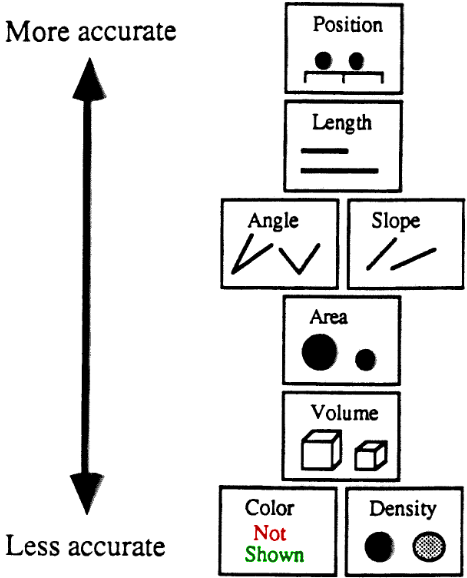
Mackinlay gives this ordering of accuracy for quantitative data, using position to express level of accuracy.
Ordinal and Nominal Values
There are other “graphical languages” that tend to work better for the non-quantitative values
These also all communicate information and should be used if and only if that's appropriate.
Colour
Mackinlay lists density as a factor, indicating pattern density (as far as I can tell).

Let's take that as equivalent to value or lightness for modern printing/document technologies, and thus part of colour.
Colour
For quantitative values, colour (by itself) is hard to use well.
None of hue, saturation, or value say anything clearly:


Colour
Obviously I'm being glib: it's entirely possible to convey quantitative information meaningfully with colour.
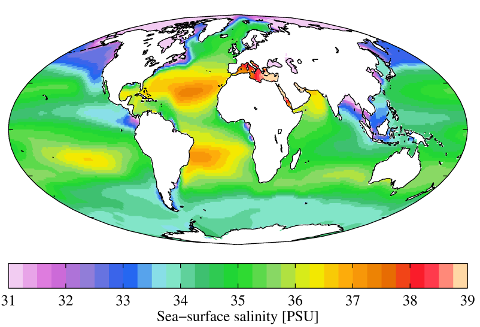
Colour
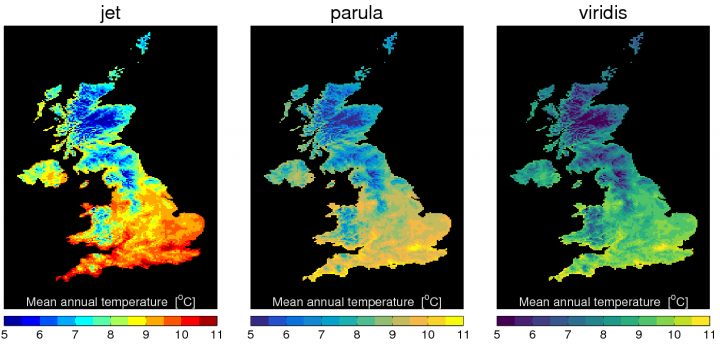
… but it's not easy. Deciding how to map number to colours (a colourmap) is more complicated than you think.
Video: A Better Default Colormap for Matplotlib. Watching 2:45–3:40 and 10:30–18:00.
Colour
This is likely to convey quantitative data (5–11) in an ordinal way (little, some, lots), but that might be okay. e.g. bad old default, new default Matlab, new default matplotlib.
Colour
Colour can be used to add another dimension of data to a visualization.

A lot of precision might not be possible (or needed).
Colour
The lesson: colour can be used to communicate quantitative data, but it's definitely not the first choice.
It can reasonably be used to display ordinal data.
Colour
Colour is more obviously applicable to nominal data. It can be used to add another dimension of information.
Here, position L↔R for (ordinal) size, and background colour for (nominal) location.

Texture
Texture isn't used as often as it would have been in 1986.

Modern displays and printing are better at greyscales and colour, so people don't resort to textures as often.
Texture
But colours and greys don't always survive printing/scanning/photocopying processes very well. These might look the same after you make copies for the meeting.

Example: the “not relevant” properties in Mackinlay's ranking. Were they originally grey?
Texture
Not-too-dense textures generally will survive and still be distinguishable.
These can reasonably be used for nominal data, and maybe ordinal if you they have obviously-different densities.
Connection/Containment
Not good ways to convey quantitative data, but can indicate the same category (either ordinal or nominal).
This used containment (in the implicit left, centre, right columns) to indicate category:
Connection/Containment
These become much more of a factor for diagrams (as opposed to data visualizations).
Containment: arranging data in an enclosed area/box/etc.
Connection: connecting visual elements with lines or arrows or similar.
Connection/Containment
Containment can convey these are part of the same category
or these are related concepts
or ….
Connection can say these are related concepts
or there is a transition between these
or there is data shared between these
or ….
Some examples…
Connection/Containment
UML class diagrams use containment to indicate parts of a class, and public/private members within the class.

Connection/Containment
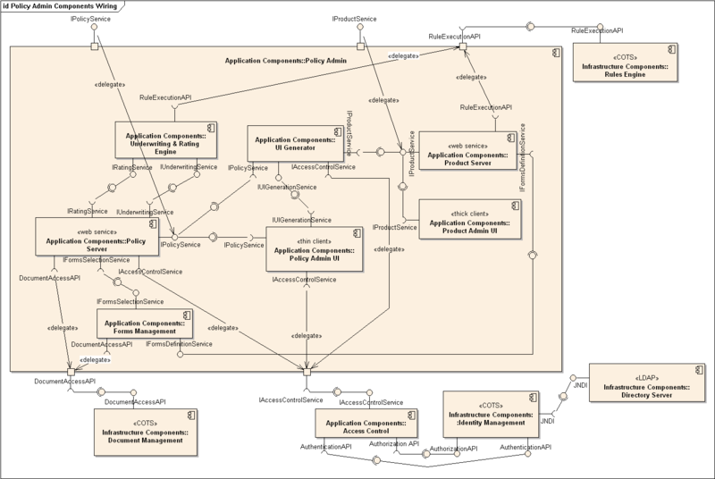
This UML component diagram uses containment for internal/external components.
Connection/Containment
It also uses connections to indicate… whatever UML component diagrams indicate. Data flow?
Connection/Containment
This uses connections to indicate information being passed between actors (grouped by containment/position).

Connection/Containment
Flowcharts use connections to indicate paths through the process/algorithm.

Connection/Containment
Mackinlay's visualization uses connecting lines for “same graphical language” and containment for “not relevant”.
Connection/Containment
Linguists use trees to represent phrase structure grammars: connections for substructures and instatiation. Line texture distinguishes those. Position for position in the sentence.

.png)
Shape
There's really no way to get quantitative or ordinal information from shapes.

But they can be used to indicate nominal information: categories.
Shape
Flowcharts also use shape to indicate category of action (and colour in this case):
Shape
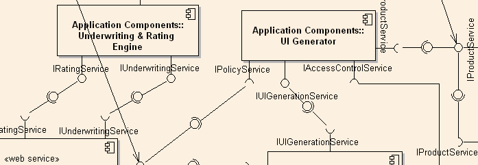
UML component diagrams use shapes on the connections to indicate something, probably.
Graphical Languages
Summary: there are many things you can do in a visualization to carry information to the reader. Choice will depend on the kind of information. Know your options.
Converse: choices you make in the visualization will be interpretted as informative whether you intended it or not.
Graphical Languages
When you create a visualization, pay attention to the factors that are not supposed to carry information.
It's easy to imply information you didn't intend, and be dishonest because of it.
Graphical Languages
For example, what did the order of examples here (top↔bottom) mean?
It's not alphabetical. Order of population within category? The order I thought of them? [It's the last one.]
Graphical Languages
In particular, be careful of changing some factor for no reason (or because of a reason you're not trying to express). Don't need it → don't show it. e.g. what is colour for here?

This is school colour, according to Wikipedia.
Graphical Languages
It's easy to accidentally very something just because of sloppy creation or editing.

Why are SFU and UVic closer to each other? Connection in a category? Careless placement?
Graphical Languages
If a piece of your visualization has a different colour, font, size, shape, slope, … then there should be a reason.
You have to vary position: try to do it in a meaningful way.
Graphical Languages
The final lesson is the same as the writing parts of the course.
- Know your options.
- Use them wisely.